

Aptos is Microsoft’s New Default Font
A Brief History of Fonts
Times New Roman was originally designed by Stanely Morison and Victor Lardent in 1932 for The Times of London newspaper. The serif font quickly became one of the most popular fonts in the world due to the fact that it was easy to read on paper, and was a good choice for screen displays. Since 1995, Times New Roman was the default font that users were familiar with when they used any Microsoft Office tool. In 2007, Calibri replaced it as the default typeface in Word and it also replaced Arial as the default in PowerPoint, Excel, Outlook, and WordPad. And now, a new font—named after the town in Santa Cruz County that’s home to Seacliff State Beach, Rio Del Mar, and more gems—has entered the doc: Aptos.
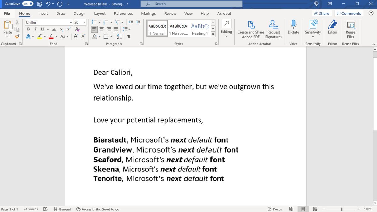
Microsoft tweeted this image of a word doc where they have penned a farewell letter to Calibri and announced the company’s potential default font replacements.
The Battle of 5 Fonts
The search for this new font has been a few years in the making. In 2021, Microsoft announced they were ready to part ways with Calibiri and were on the hunt for a new default font. Microsoft recognized that the times and technology were changing and wanted a new look to reflect that. They announced the top 5 contenders and let users pick their favorite. Font lovers were eagerly awaiting the results. Finally, on July 13, 2023, Si Daniel, Principal Program Manager for fonts and Typography for Microsoft Office Design announced via Medium the font that would replace Calibri: Aptos. Wait, what…? That wasn’t one of the original options, was it?
Welcome Bierstadt Aptos
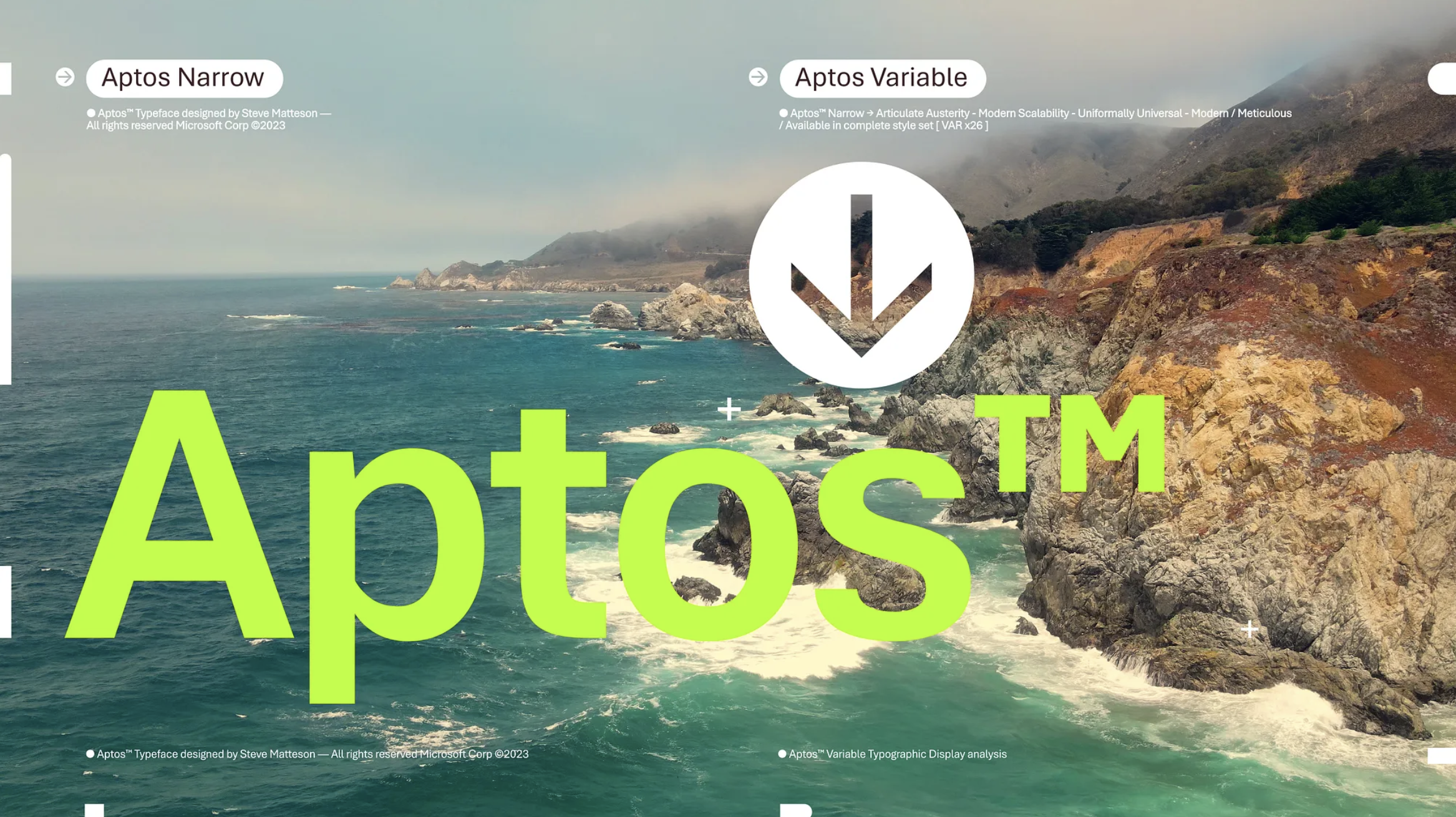
This new font designed for Microsoft was created by Stephen Matteson, the same designer behind the Segoe font used in Windows as well as the Droid font used by mobile company Android. Originally the font was named Bierstadt after Mount Bierstadt, one of Colorado’s 14,000 ft peaks (also German for Beer Town). However, as we all know now, that is not the name the font ultimately ended up with. Why Aptos? According to Si Daniel, “Steve renamed the typeface he designed from Bierstadt to Aptos after his favorite unincorporated town in Santa Cruz, California, whose widely ranging landscape and climate epitomizes the font’s versatility. The fog, beaches, redwood trees, and mountains of Aptos summed up everything that he loved about California.”
Calibri vs Aptos

What makes Aptos different from Calibri? When Stephen set out to design a new font, he specifically wanted one that was professional but had a warm, human touch to it as opposed to one that felt entirely mechanical. Aptos is slightly wider, sharper, and spaced out than Calibri which is intended to make it professional but inviting and relaxed in appearance for the eyes. For example, Si comments, “The heads of i’s and j’s are circular dots as opposed to grotesque squares.” Aptos is also a sans-serif font, which means that it does not have the small strokes at the ends of the letters like Times New Roman. This makes it a bit more modern-looking than Calibri, and it is also a bit easier to read on screens. Despite the change, Calibri will still be available at the top of the new font menu for those who aren’t quite ready to say goodbye.
Let us know what you think of the font!